The Trend Analysis Report Make a trend analysis across your portfolio and see the ongoing trend of your usage. Place usage goals by percents and set a monthly budget.
The Trend Analysis is found beneath "Reports" in the Report menu and is a great way to get a quick overview of the usage trend. It can be used at any level of your real estate portfolio, on top level or even down on individual properties.
Three things to think of before we dive into analysing.
-
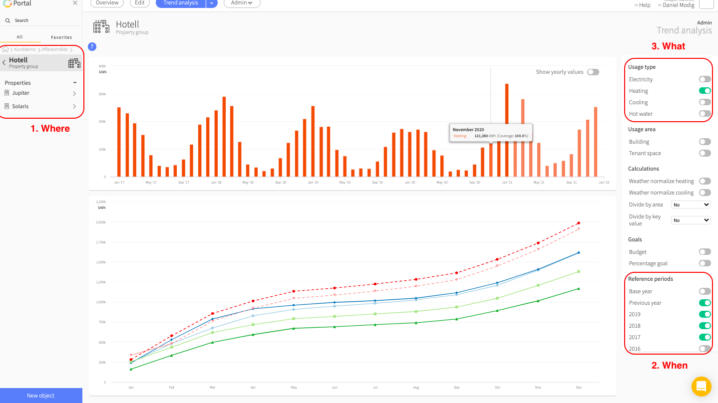
Where do we want to make the analysis?
The Trend Analysis makes it possible for us to visualise the energy usage over a longer period than other reports in Mestro. The visualisation can be made on all levels in Mestro Portal and is a fantastic way to see how well your work with energi efficiency are paying off at a larger scale. -
Which period do we want to examine?
Think about which period you would like to search for trends over. The Trend Analysis differs from other reports by not letting you pick the period at the top, instead you activate chosen years in the Report settings. -
Which kinds of usage are we analysing?
In The Trend Analysis you can chose between different kinds of usage when making your Report. It is also possible to combine different kinds in the same category. So check the energy kinds you would like to examine.
PRO-TIP: Boost The Trend Analysis by adding the right information to Mestro Portal. Look even closer on the following information:
-
Area: Make sure that all buildings and properties share the same area type to see the key figures provided by the option Divide by area.
-
Weather normalisation: Register correct address and Degree day location in Mestro portal. Read more on this topic here.
-
Usage - purpose: Separating how much energy is used by certain purposes is easy once this information is added to each of your meters. More information can be found here.
-
Have a look at other key figures and the base year, these are found in the Edit menu when positioned at the customer node in the node tree.
The Trend Analysis' different parts
The Trend Analysis consists of four different parts, visualising different sides of your usage.
Trend bars
The first part decorating the top of The Trend Analysis is the Trend Bars, which gives an overview of the selected period. There is also a prognosis for the current year, which is described further down. It is also possible to change from monthly values to yearly values to get an even rougher estimate.
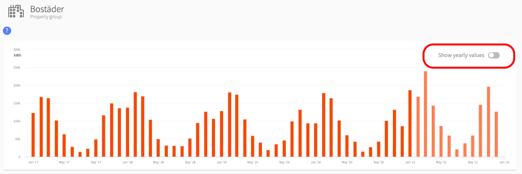
NOTE: You must choose every year within the period, years not activated will show empty in the graph otherwise.
Cumulative line
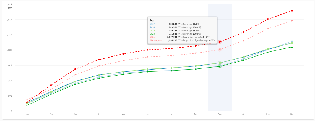
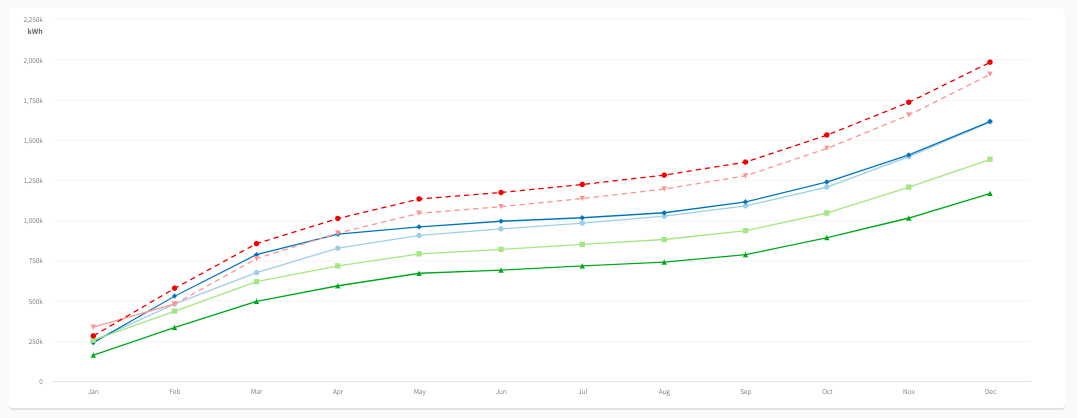
Next in line is the cumulative usage as lines, where every line is representing a year or an accounted value, like Normal Year and the prognosis represented by dashed lines. This visualisation clarifies how smal differences between months can build up to a huge difference in the end of the year.
As an example we can study the light blue line and he darker blue line below. It is clear that the darker blue uses much more energy than the lighter blue even though it is just one year apart. This behaviour could be done by a weather phenomenal, which Weather Normalisation would compensate for.
Year comparison by bar digram
One square down we find a year comparison which allows us to compare two specific years within the activated period. By combining this visualisation with the Cumulative Line diagram you can go into finer details on two years which stand out of the crowd. It is possible to compare any years, either by using the arrows on the sides or by clicking on the year.

NOTE: Please note that chosen years outside of the activated period do not show. If any data seems to be missing, please double check your Report settings. Even experienced users makes that misstake sometimes ;)
Year comparison by table
The last part is the Year comparison table. The table is based on the chosen years from the bar diagram above. Here is a more detailed view of the numbers with corresponding change in percent. From this report it is also possible to save the table to Excel or CSV, if you would like that.
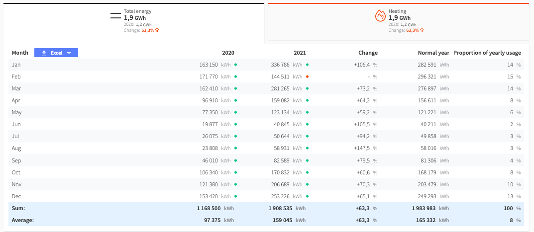
This report combination (with both diagram and table) could be viewed as a miniature version of The Usage Report, but for two specific years side by side instead of in the same diagram.
What is a Normal Year?
Normal Year is something often compared to in The Trend Analysis and is actually just the previous year. Same as in the other Mestro Report there called "Previous Year".
How does the prognosis work?
The prognosis is based on a normal year that's scaled with a factor. This is calculated based on the last 3 months total usage for the current year, divided by the total usage for the same period during the normal year. The factor is then applied such that the prognosis has the same percentage change. If the change is greater than 20 percent, positive or negative, a value of 20 percent will be used in the calculation.
How you can use The Trend Analysis
The Trend Analysis is mostly for you who wants an overview of ongoing trends and historical trends in usage. However, by combining the report with key values and other functionalities in Mestro Portal, it is possible to gain great insight in your usage!
Weather Normalisation - Needed when analysing heat
Are the numbers you're looking at highly depending on the weather? Well in that case you should consider activating Weather Normalisation, and I will show you why!
Below you'll see our example from Cumulative Line where we pointed out the difference between the light blue line and the darker blue one. It is rather obvious that the darker blue line had a higher usage during the beginning of the year, and had a higher cumulative usage pretty much during the whole year.
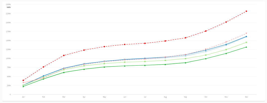
If we now activate the Weather Normalisation in our Report settings the situation will change. Suddenly the two lines pretty much follows each other the whole year. Apparently we were right before, the weather did make the difference.
If you are having problems with weather normalisation or are interested in how it works in Mestro Portal, you can read more about it here.
NOTE: Weather normalisation is based on the postal number in Mestro Portal. That's why it's always important to add the correct information to all added premises.
Divide with area - get that honest picture of your usage
If your real estate portfolio is in constant change with building expansions, added properties or sold properties, it is hard to know if years are compatible to compare in raw numbers. That's why Divided by area is a great way to make this work. In the Report Settings you can choose which area to divide the usage with and then you can more easily compare the usage of each year. This division is made throughout the report.
A use case
So, you are looking at the previous year and realise that 2020 is back on the same level as before 2019. Both weather normalisation and divided area are activated to compensate for changes in weather and real estate portfolio between the years. It is the compatible usage data we are after.
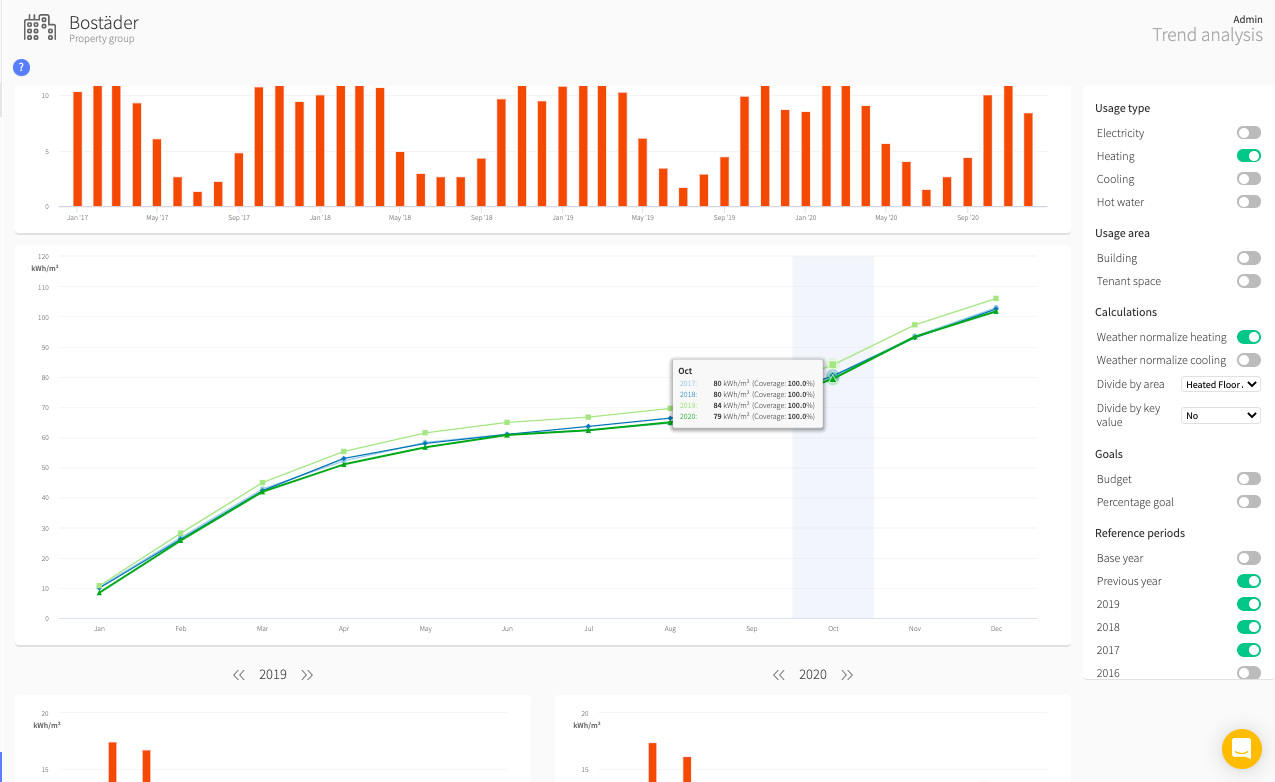
It is obvious that 2019 (light green line) is higher during the whole period, nu it seems like the distance between the lines grow more during the period. It starts out with a two kWh per area difference, just to grow to a 4 kWh per area difference by the end of the year. To understand which months contributes to this increase, you scroll down a bit to the Year comparison and makes a comparison between 2020 and 2019.
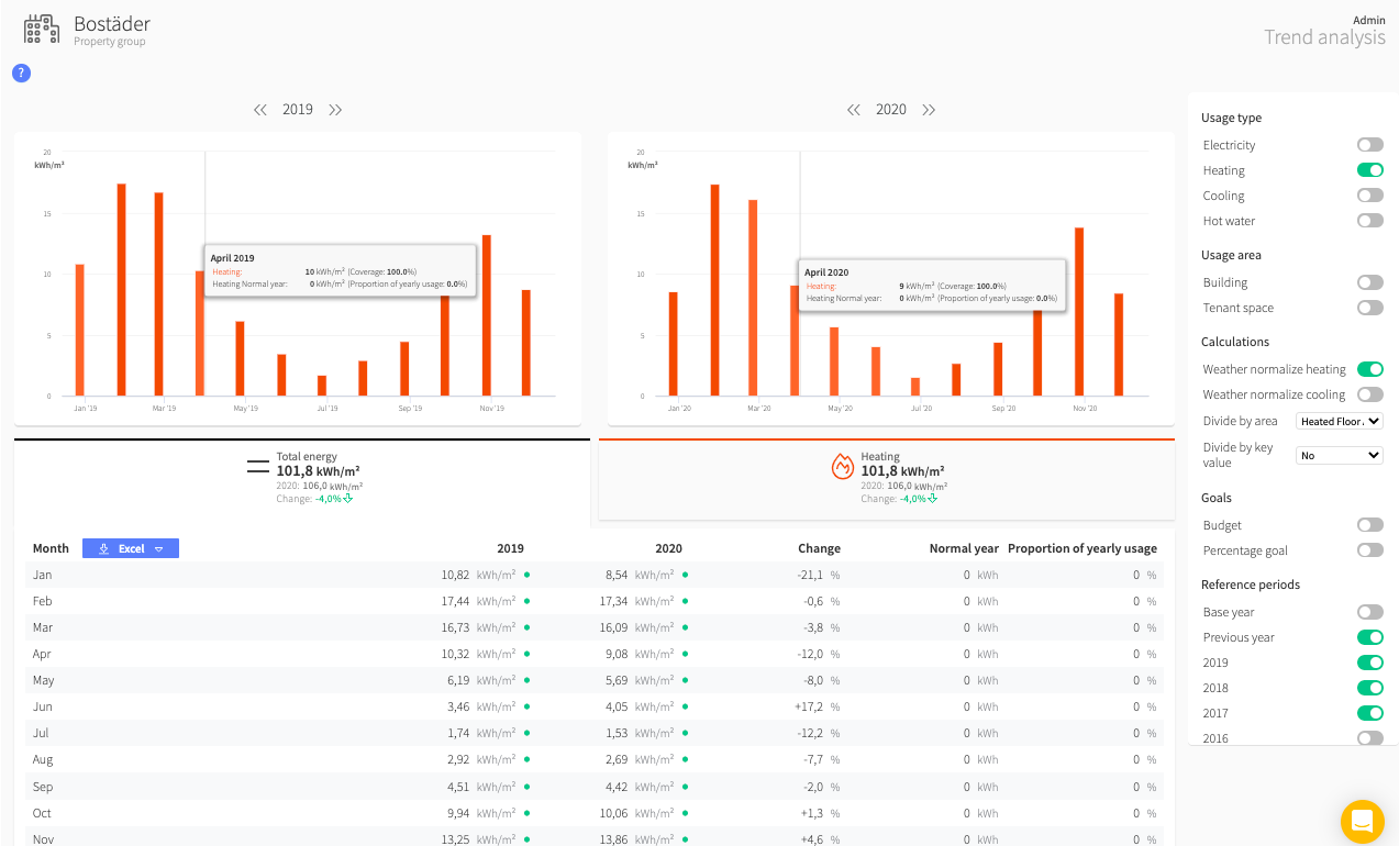
In the table it is clear that the difference is especially big in January and during the summer months. If this seems odd, based on the knowledge of your portfolio, the next step would be to make a Ranking Report on the premise group "Bostäder" to see which of its premises that contribute the most to the rising increase, just to se if anything special did happen during 2019 to make it stand out.
Hopefully this gave you an understanding of the potential of The Trend Analysis and how to use it!
One last thing!
We are a company in constant development and welcome your concrete opinions and feedback. Do you miss something or could a feature work better? Contact your Customer Success Manager or support@mestro.com . We would truly appreciate your feedback on how to make Mestro even more useful to you!
