Review your energy usage, or analyze it thoroughly, by using the Usage Report
The Usage Report is the very first tool listed under the name Usage in the report menu found at the very top in Mestro Portal. It is a great place to start monitoring your energy usage as it provides you with a comprehensive overview.
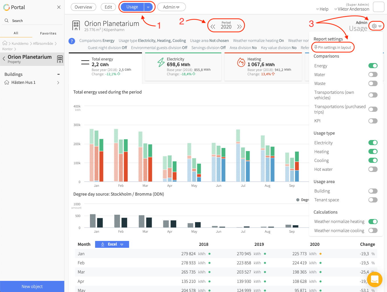
Get started by following these 3 simple steps:
-
Pay attention to where you are currently positioned in the node tree as this determines what the User Report will show you. It can for example be a property group, a building, or even a specific meter.
-
Make sure that you have selected the time period you wish to see by clicking the arrows next to the year at the top of the report view. You may also click on the numbers to display a drop-down menu which allows you to choose a more specific time period such as Q1-Q3 or April-September. Find more information on choosing time period by clicking here.
-
Before you dive into the report we advise you to click on the gear (Report settings) icon to the right and then on Pin settings in layout. This gives you a good view over which settings that have been toggled on/off or chosen in drop-down menus, for example usage type, calculations and reference periods.

Pro Tip: The Usage Report will become an even more powerful tool if the following information is added to your properties, buildings and meters:
-
Area: Make sure that all buildings and properties share the same area type to see the key figures provided by the option Divide by area.
-
Weather normalization: Register correct address and Degree day location in Mestro portal. Read more on this topic here.
-
Usage - purpose: Separating how much energy is used by certain purposes is easy once this information is added to each of your meters. More information can be found here.
-
Have a look at other key figures and the base year, these are found in the Edit menu when positioned at the customer node in the node tree.
How to use and adjust the User Report for your needs
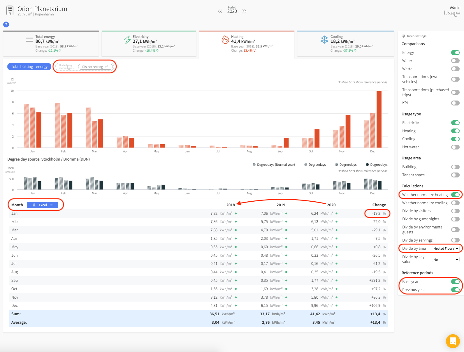
The User Report always displays a bar chart, as well as a data table. Each bar represents a single month. The bar furthest to the right in each 'month section' represents the time period you have chosen. The transparent bars on the other hand represent the reference period. This feature makes this report a great tool to use for comparing energy consumption over time.
Pro Tip: Information listed in the data table can be easily downloaded in an Excel or CSV format by clicking on the blue button located over the table to the left.
The initial view in the report shows the information found under the tab Total energy, all of the selected usage types are summed up here. Clicking on the other tabs lets you see consumption data for the specific usage types. As an example, let’s have closer look at the heating bar.

Many of our customers choose to weather normalize their heating data. Degree days is a measure on how much the outdoor temperature has differed from the norm at a specific location. The User Report allows for this to be adjusted by simply activating the option Weather normalize heating in the report settings. Seeing the degree days for a specific location is possible if you look at one single property, or several properties belonging to the same degree day location, once this option is turned on. You cannot see degree days for an entire portfolio if the properties for example are located in different cities. More on weather normalization can be found here.
It is also possible to divide the energy consumption by area, just select the preferred area type in the drop-down menu found in the report settings under Divide by area. Choosing this option automatically provides a useful key figure on the energy consumption per square meter.
The report allows for the comparison of your energy consumption in relation to one or two reference years. Activating this option is done by toggling the specific years at the bottom in the report settings under Reference periods. You may also compare the consumption to a previously set Base year. The change in percent, which can be seen to the right in the data table, specifies the difference between the earliest and latest reference year. By looking at the image above you can see that the change in this case is calculated from the year 2018 to 2020.
Please note that to be able to display certain key figures or data in the User Report, you need to have the specific information added to begin with. If, for example, you do not have any meters reporting on your warm water consumption, you will not be able to see any reports for this usage type. It is likewise impossible to divide consumption by area if there are no areas added for the properties or buildings in your portfolio. Such a division is also impossible if looking at one or several specific meters.
Bonus: In our heating example above, you may choose to either look at the Total heating - energy (the blue box positioned underneath the Total energy tab) or the District heating [cubic meters] option. Note that this option is only possible if you report volume data for the specific property.
Finally…
The User Report has the same user interface as the Cost and Environmental impact reports so that even more interesting data concerning your energy consumption becomes easily accessible to you!
We wish you the very best in analyzing your energy portfolio!
Best regards,
Team Mestro 🦸♀️🦸♂️
One last thing! We are a company in constant development and welcome your concrete opinions and feedback. Do you miss something or could a feature work better? Contact your Customer Success Manager or support@mestro,com . We would truly appreciate your feedback on how to make Mestro even more useful to you!
