One of our advanced tools where you can analyze your data at a detailed level to identify usage patterns around the clock.
For those of you who want to dig deep into your data, we recommend that you check out the Usage Analysis. Here it is possible to follow up your energy use from minute to minute on an individual meter, on the entire stock or everything in between.
The Usage Analysis is used to analyze data at a higher level of detail, and can display high-resolution usage data all the way down to minute values. With granular data, it is possible to see, for example, where media use peaks or what the usage looks like during each day. It is also possible to compare usage between different meters with the tool "compare selected".
Prepare the analysis
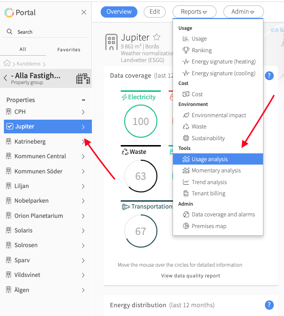
1. Select the region / property / meter you want to view
2. Click on "reports"
3. Click on "Usage analysis"

4. If you haven't already done so, click on the gear icon in the upper right hand corner to pin the report settings.
5. Set the parameters and which media types you want to include in the analysis in report settings.
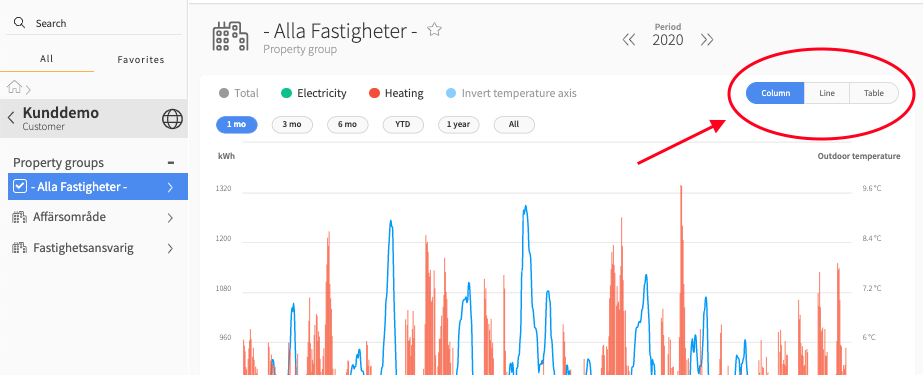
6. If you want to see the data in column, line or table form, you can change this at the top right of the visualization window.

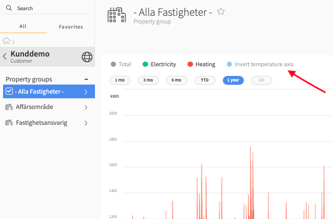
In the Usage Analysis it is possible to invert the temperature axis.
TIP: Toggle outdoor temperature in the analysis under Momentary Data in the report settings.

Different ways to view the data
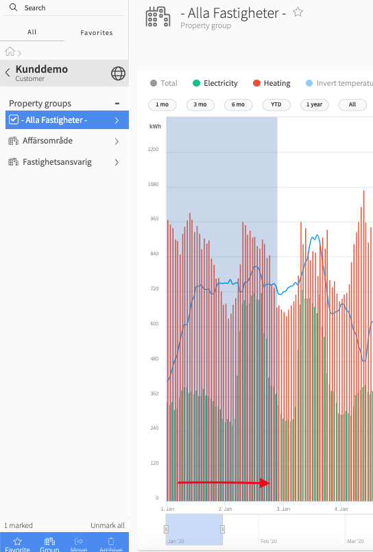
You can choose to see different time periods in your graph. You can choose between the default time periods at the top of the graph (image 1) or zoom in on any period by dragging the mouse pointer on the period you want in the graph, see image 2.
Image 1

Image 2

Peak loads
Peak loads are cut at > 1500 kWh on district heating meters. If you know that such peaks are normal for the property, contact us at support@mestro,com and our IT department will configure the calculation engine to reflect this.
In the future, you will be able to adjust this threshold yourself in the portal.
BONUS!
In the Usage Analysis, you choose between three different ways to study the data; column, line or table format. The column graph shows the raw values without any grouping. The line graph can be grouped as follows: 1, 2, 3, 4, 6, 8, or 12 hours, 1 day, 1 week, 1, 2, 3 months and then the graph library chooses how the data is best grouped. If you mark different periods, you will thus get different groupings based on the length of the period and the resolution of the data. The table will always use the same grouping as the graph you were last in.
TIP: You set this at the bottom of the report settings under Data settings.

When you are happy with the settings, just dive in!
Finally...
We are a developing company and appreciate your feedback! If anything is unclear or you wish to share your ideas, don't hesitate to contact your Customer Success Manager or send an email to support@mestro.com .
